Wave 4 Review.

Hey everybody,

Wave 4 is now completely out and it actually goes a bit in line with the Star Wars The Clone Wars Season 4 Series.

So without further ado:

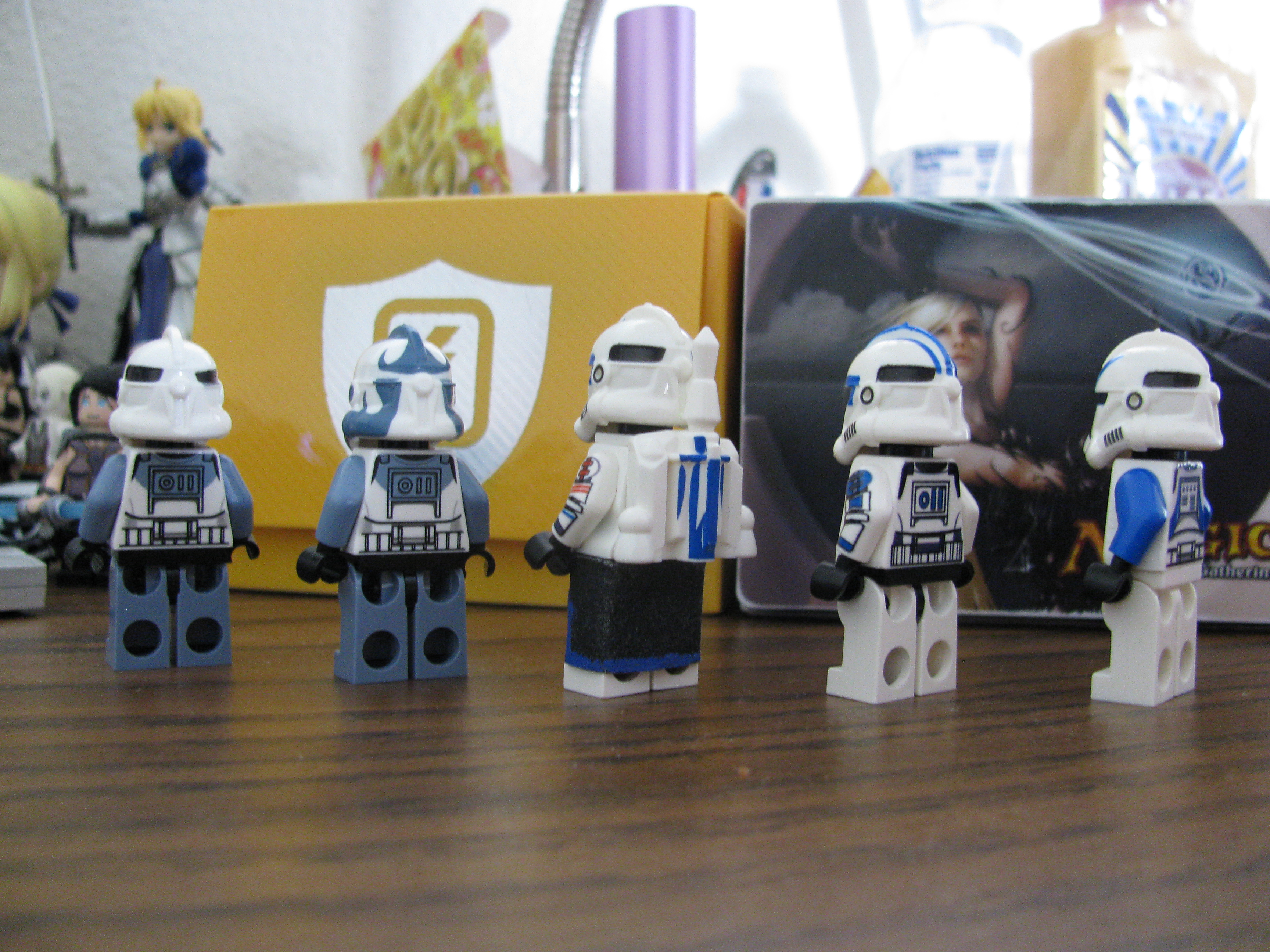
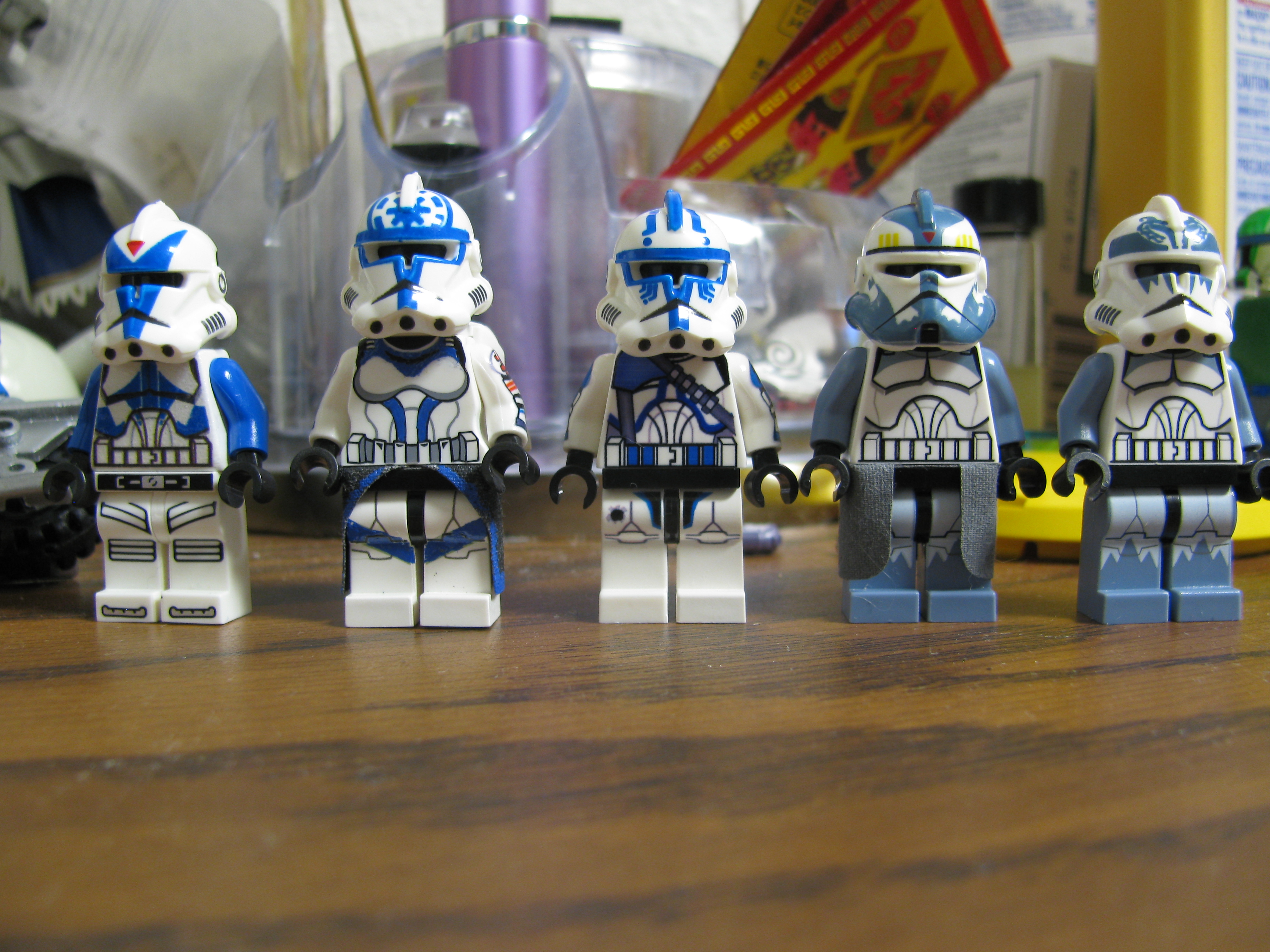
From left to right: Dogma, Jesse, Hardcase, Commander Wolffe, Boost(Couldn’t find a good picture).

*Dogma’s Torso comes from a decal applied by Republic Customs, Jesse’s torso is a modified arealight torso with Greenpea Toy’s arms and an MMCB wasit cape. Hardcase’s body is from Greenpea Toys. Commander Wolffe and Boost’s bodies are from Lego.

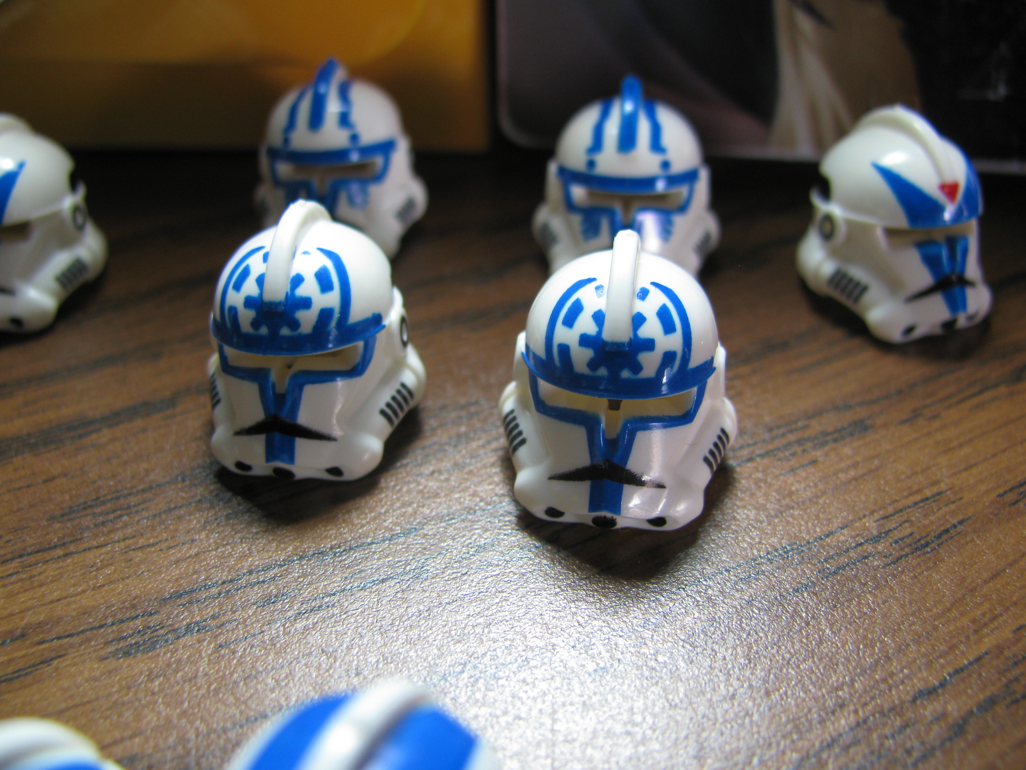
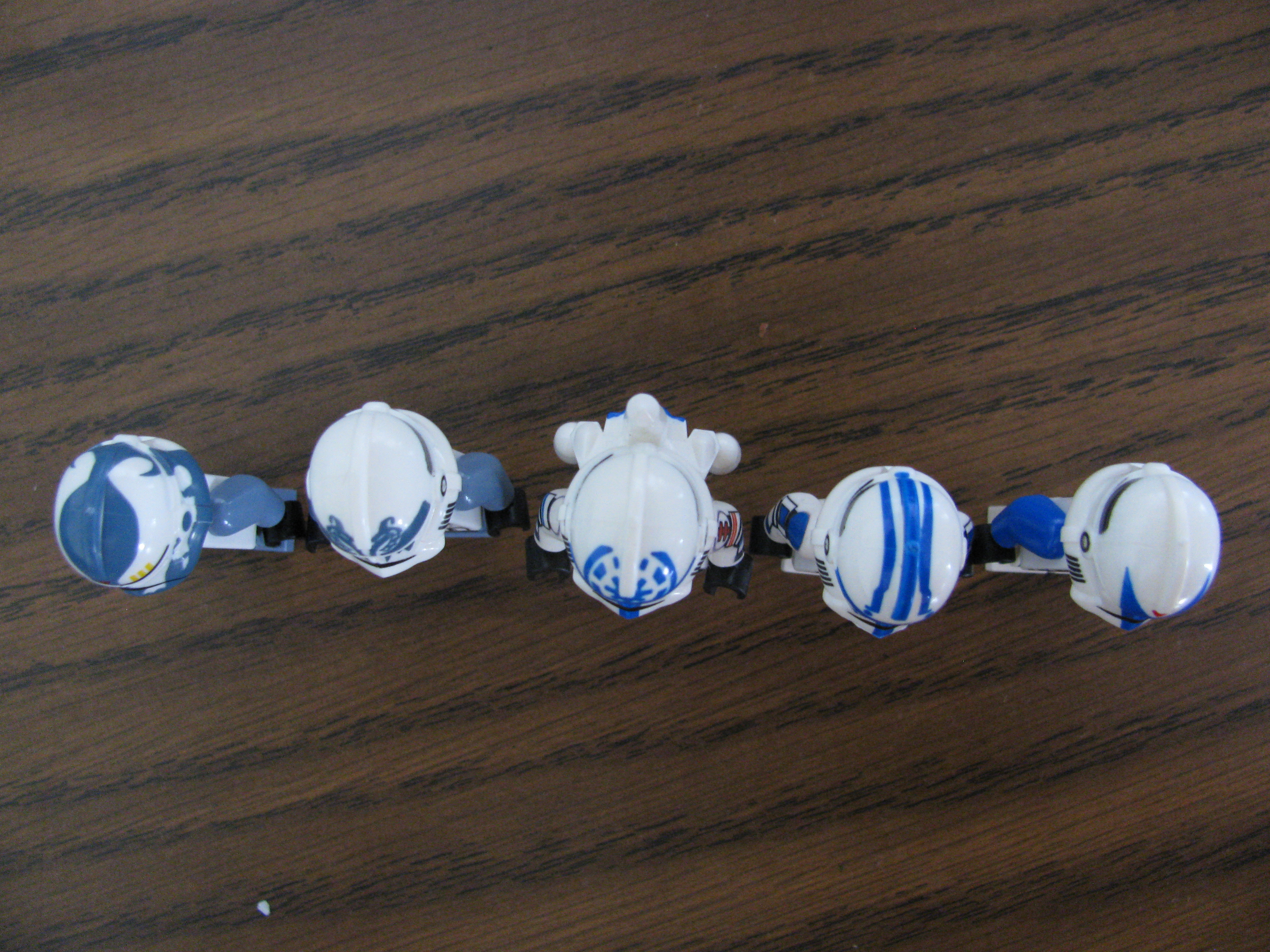
All of these helmets are a pretty accurate representation of the clone troopers that they are meant to resemble. To be perfectly honest though, the printing isn’t as clean or clear as the previous runs.


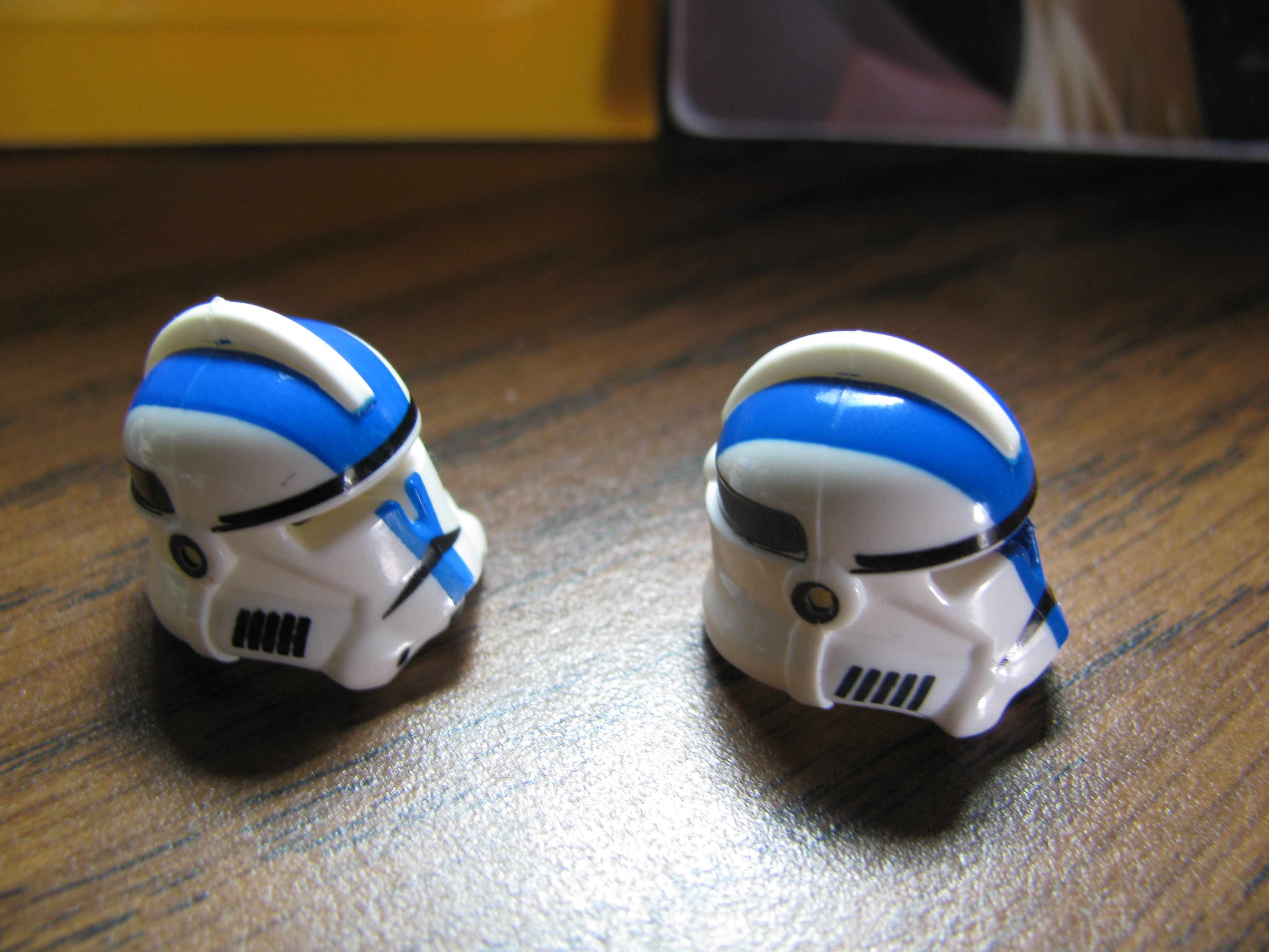
Dogma: Dogma’s helmet is pretty accurate as I said earlier, but one issue I have is that the blue on the edges is a bit light compared to the blue everywhere else. I don’t know if this shows up on other helmets, but it does show up on the copy I received. Regardless it’s still a pretty nice helmet.

Jesse: Jesse’s helmet features a Lego Blue print that has the republic symbol (which in my honest opinion looks pretty good for being printed onto a curved surface) blue trim around the visor, and your generic clone helmet markings. The print job is pretty good, but there are a few issues with the lighter colour with the edges that the printing got onto. Over all though the helmet is nice and has a great looking design.

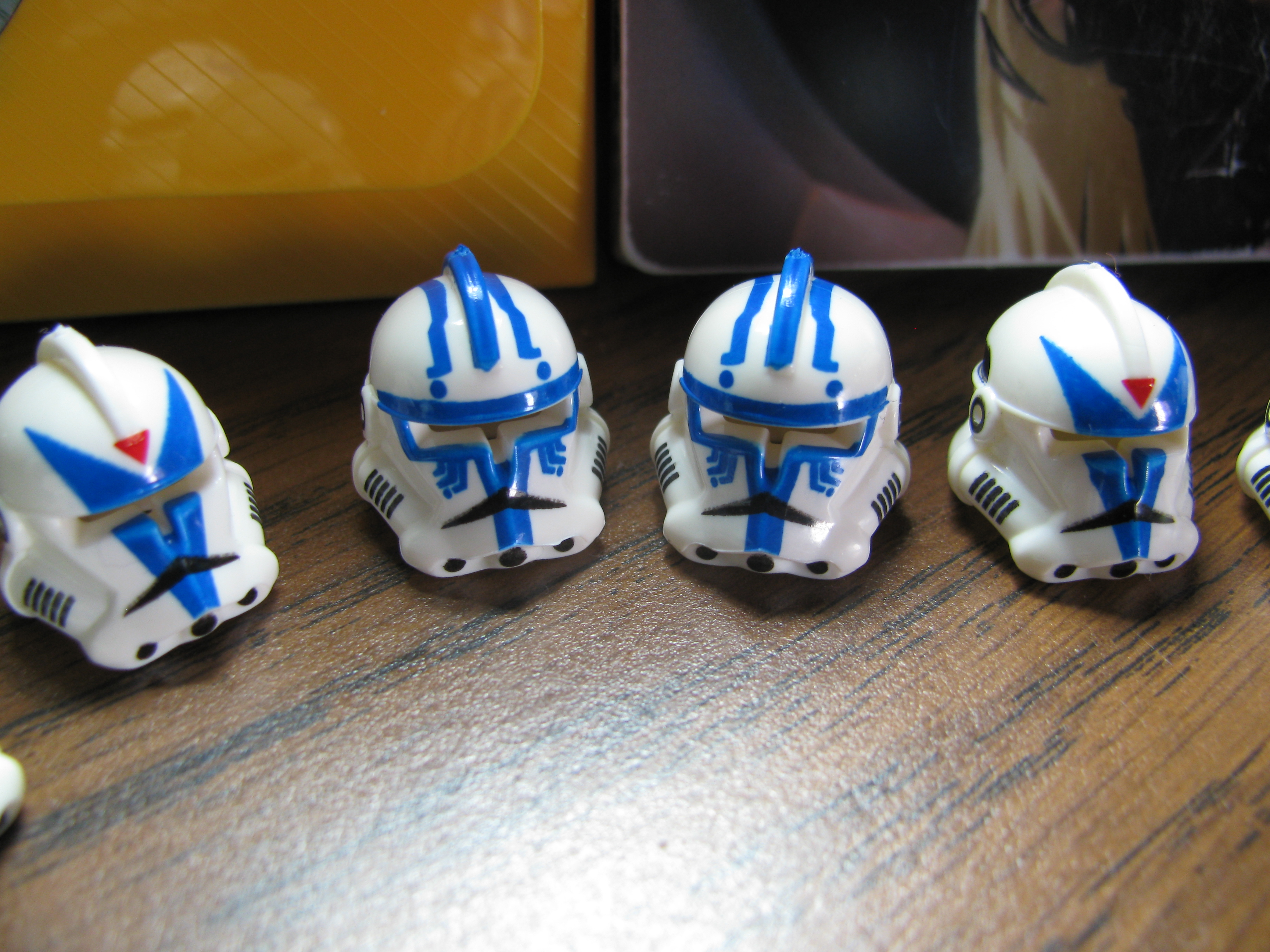
Hardcase: Hardcase’s design is actually really nice. It features blue printing that shows up pretty clear. The only real problem I can see with this is that the design is off center on some of the helmets. It’s really not that big of an issue though since it isn’t too noticeable. If you’re good with Brasso and want Kix without adding any paint, Hardcase is the way to go.

Wolffe: Wolffe by far is definitely the star of this release. He features a great design, which matches Lego’s Sand Blue and Arealight made a pretty dead on replica of the design on the show. No real flaws that I can see on this besides the fact the back wasn’t printed. However, printer limitations prevented having a print that runs all the way around without the possibility of problems.  Definitely pick this up if you get the chance.

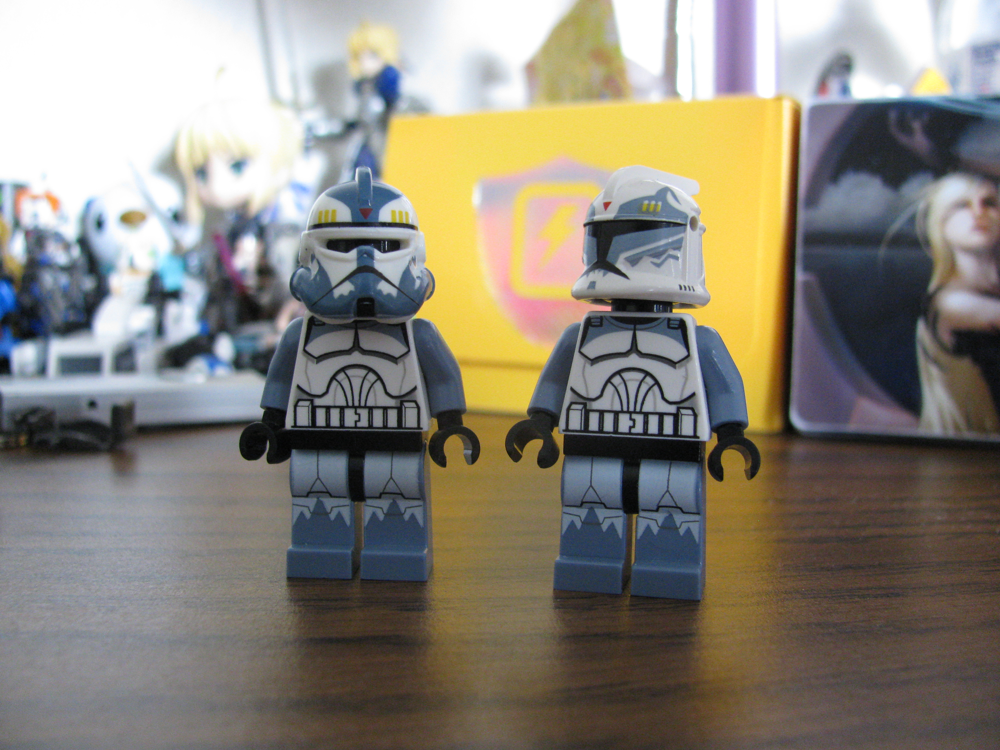
Boost: Boost from what I’ve seen matches pretty well. I haven’t been able to find a picture from the show to reference, but he is pretty similar to most Wolffe Pack Troopers and as before with Wolffe, arealight did a great job with matching the colors. A bit of brasso on the spikes under the visor and you’ve got your generic Wolffe pack trooper.

Overall: I would have to say that this Wave turned out extremely well despite being so small in comparison to previous waves. Although the print quality isn’t as good or clear as the first wave Arealight released, it’s still fantastic. (The printing is pretty hard to remove beyond scraping it off with a knife.) Honestly, I could easily recommend these especially to people who are a fan of the Clone Wars series. Even if you aren’t, I would definitely suggest picking up at least Wolffe, simply because his helmet looks amazing.

Anyways, here are a few more shots of the helmets. (Hover mouse over image for more information).

Review: Revamped Commando Helmets

Hey everyone,

I’ll be reviewing the commando helmets that were released before Christmas today since Wave 4 will be coming out soon.

Anyways, let’s start off with some pictures:
Left to right:

Fi Helmet, Sev helmet, Niner Helmet, Fixer Helmet, Scorch Helmet.

Anyways,

These are highly similar to the previous helmets, except Arealight has gone back and added in the visor gradient.

Here’s a quit run down of the helmets individually:

Fi : The Fi helmet is a black print with a very dark grey for the visor with a blue gradient printed over the visor. Arealight did a pretty good job in making the visor visible despite the visors being two very dark colors. The design itself is essentially a black version of Boss/Fixer. As usual, the printing is very clean and clear.


Sev: The Sev helmet is basically a revamp of the older one. Arealight added in the blue gradient for the visor and made the “blood” print a bit more clear and has a bit more of an organic feel to it. (The marks are a bit more curved around the ends.) Over all it looks pretty good.

Niner: Niner is essentially a blue version of Boss and Fixer. I personally like blue and the print itself is extremely crisp . There isn’t really much to say about it, but if you’re a fan of the character or like the color blue; then I would go ahead and pick this up.

Fixer: Fixer is a revamp of the old helmet. The green is a bit brighter from what I can tell. The ink itself didn’t set correctly on some of them, but it still looks good.

Scorch: The scorch helmet is a complete revamp of the previous helmet. Arealight took advantage of the new Dark Bluish grey plastic he decided to mold his helmets in. The design itself is fantastic. The white is is pretty clear and the print design itself looks amazing. I believe this has to be my favorite of the helmets and it definitely is a step up from the original. I would highly recommend getting this one even if you already have the previous version.

Overall:
The revamped commando helmets are great. If didn’t get a chance to pick up the previous ones or even if you have gotten them, I would suggest getting these. The gradient itself looks great although on a few of the helmets it’s a bit off center. Regardless, the designs are all pretty clean and crisp and definitely a step up from the originals. Unfortunately I don’t have my Boss helmet on me so I wont’ be able to get those up.

Anyways the rest of Wave 4 will be coming out later this week and I’ll be uploading a review for it once I get my samples.

-Apples

Jetpacks!

Alright, here’s the last of the reviews: Jetpacks

To be blunt, I feel these stand out the most out of this new release. Arealight’s jet pack design was already amazing, adding to them is just like icing on the cake. I was really excited about these when I was first told he’d be producing them and even more so when he sent me one of the original runs that didn’t turn out just right.

The one on the left was the original run, the one on right is the final version of the Jango Fett Pack.

Left To Right: Boba Jetpack II / Isabet Jetpack / Mij Jetpack / Jango Jetpack / Vizla Jetpack / Boba Jetpack I

Arealight released 6 jet packs. Each one comes with the rocket accessory unlike their unprinted versions which include a warhead. Warheads and rockets are both sold separately.

I find the rocket goes better with the jetpacks anyways.

I’d rather not bore you with describing each on it’s own since they all have very similar print designs, so instead I feel it’s best to just let the pictures speak for themselves in regards to that. Each of them is colored specifically toward a character and Arealight did a great job of matching those colors.  I personally felt would have improved them would have been having the print on the boosters go all the way around, but the printer’s ability to print on that type of surface is pretty limited. Regardless, the printing on all of these are extremely clear and crisp. I can easily suggest getting any of these to anyone even if you aren’t that big of a Star Wars fan. Even though each design caters to a different character, the variety still allows you to make your own custom figure in the star wars universe or outside of it.

Small side note: The two Boba Fett jetpacks have the same print on different colored jetpacks (Sand Green and Blue).

Being completely honest here: It’s hard for me to recommend one over the other, so if you do intend on picking just one or two up: go with the color scheme you enjoy the most. You really can’t go wrong with any of them and they are definitely a step up from the normal Lego jetpacks which were just a wee bit too small.

As a closing note to this:

In regards to Wave 3 itself, I personally see it as a stepping stone for future print designs. Arealight printed onto two items he’s never printed on before: the AT-RT Helmet and the Jetpack. Both of these items have odd shapes as well, which in turn make the printing process harder than it already is with the normal helmets. While I can’t exactly say what is planned for the future I can easily tell you that more great print designs are definitely in store as well as a few other fun things.

I hope you enjoyed these and I hope they help you in your purchases.

-Apples

AT-RT Printed Helmets

More reviews~ 🙂

Arealight has never printed on AT RT helmets before so I’m actually pretty excited about this.

Left to Right: AT-RT Assault Helmet / AT-RT Pilot Helmet / AT-RT 212th Helmet.

(I apologize for the lack of more references, it was hard for me to find anything besides the AT-RT pilot reference)

AT-RT Assault Helmet: This helmet sports a yellow print with black detailing. I personally have never been a big fan of the design of the AT-RT helmet, but these do look nice. I’d like to point out a few minor issues that occur on all AT-RT helmets, the print doesn’t reach the area above the visor due to printer capabilities. This actually caused one of the AT-RT designs to be scrapped unfortunately. Now back to the AT-RT Assault helmet: There is a small print error on the back as well where the print doesn’t reach the back of the helmet. I would say get this helmet if you want an AT-RT helmet and want to add some yellow to your collection.

AT-RT Pilot: This is your typical AT-RT pilot printed onto a white helmet. I think it turned out pretty well, but the printing itself didn’t turn out as crisp on this as it did on other helmets. I feel it’s probably due to the odd shape of the helmet. The print on the back of the helmet is also a bit off. There isn’t much to say. It’s a new print on a helmet that has never been printed on before. I’m a bit biased due to the fact I’ve never been a big fan of the AT-RT helmet, but I think it turned out alright and could recommend it if you want to add an AT-RT driver to your collection.

AT-RT 212th Helmet:
Out of the three AT-RT helmets released, I feel this turned out the best. The simple design allowed for easy printing and it works with the bomb trooper torso. The back of the helmet is a bit uneven, but it’s not exactly easy to notice. As I said before, the printing on this turned out the best, it has the crispest printing out of the three and looks nice. I can easily recommend this to you if you want an AT-RT helmet and are trying to decide between the three.

In conclusion:
It’s always exciting to see Arealight branch out to printing on new items; but I feel the over all awkward shape of the helmet sort of ruined the printing capabilities here. I mean, they look nice, but there are subtle issues here and there. If you overlook those small print errors then it’s no big deal. All in all, these are fun new prints and I would recommend getting these if you like the AT-RT helmet.

Hope this helps~

-Apples

Wave 3 ARF

As usual, new product means more of my tacky reviews.
With this review, I’ll be giving a brief run through of the new printed ARF helmets. (sans the Shadow ARF, I didn’t receive that one yet.)

Left to Right: Trauma HelmetGeonosis Camo Boil Helmet /Geonosis Waxer Helmet

And here are a few shots at different angles. I apologize for some of the photos. Although to be honest, there’s not really much to see on the back of the helmets.

Alright so here are my personal thoughts on the helmets:

Trauma Helmet:

Trauma seems to be quite popular, not exactly sure why; but he has a nicely designed helmet and Arealight definitely captured that. Incidentally, I received two of these; one has crisper printing and the other doesn’t; both of them are a bit lighter above the nose area of the helmet though. The helmet has green print for the design, although I personally would have preferred it to be sand green to match with the new clone trooper battle pack. I feel it would have made it a bit easier for people to make their own “custom Trauma”.  All in all though, it’s a great helmet. I personally like the design of the ARF trooper helmets, so it’s a bit biased; but I could suggest getting this helmet if you’re a fan of the character/design of the helmet.

Boil Helmet:

Alright, now I’m usually not a big fan of camo; but I actually do like this helmet and the Waxer one. They both look great. The Boil helmet has a few inaccuracies: it’s missing the little face on the side and according to Arealight, a yellow triangle up top. I personally couldn’t see the triangle in any references I found though. The helmet sports a brown camo printed on a tan ARF helmet: something many people requested if I recall correctly. Although, as with the previous Camo ARF helmet, it lacks printing in a triangular area on the back. This is due to the printer capabilities, and isn’t really that big of a deal in my opinion. The rest of the helmet honestly makes up for it.  I can easily recommend this helmet or the Waxer helmet.

Waxer Helmet:

As I said before, I’m not a big fan of Camo or brown or tan; but for some odd reason, I really love this helmet. It sports a thick yellow stripe down the top and brown camo printed onto a tan helmet. As usual, arealight did a good job matching the reference, except he missed the small face on the side; but it’s no big deal. I feel it actually looks a bit better without the face on the side. Like the other camo arf helmets though, it lacks printing on the back. I can easily say that this was my favorite ARF helmet out of this round. I would definitely recommend getting this helmet.

Summary:
All in all, these are great helmets. The printing on them is very crisp, sans that single spot above the nose on the Trauma helmet. I can easily recommend picking up these helmets, especially the Waxer helmet.

As a side note: if you’re wondering about torsos for the tan helmets and you’re a bit strapped for money : Brickforge’s Decals work well if you don’t have the option of printing your own decals. The decal on the torso of the waxer helmet is put over a Kingdom’s Torso.

I hope this helps with your purchase.

-Apples